Toolbar Button (AI Assistant)
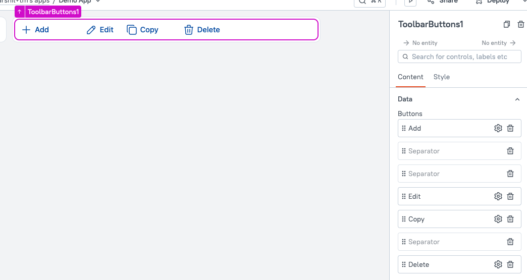
This page provides information on the Toolbar Button widget (available in AI Assistant Apps), which allows you to group multiple actions or options into a compact toolbar.

Content properties
These properties are customizable options present in the property pane of the widget, allowing users to modify the widget according to their preferences.
Data
These properties allow you to configure the data for the widget, defining the content and behavior displayed.
Buttons
Allows you to add multiple buttons within the Toolbar Button widget. You can rearrange the Buttons and add Separators to create space between them for better organization. If the number of buttons exceeds the available space, a three-dot menu (ellipsis) is displayed to accommodate the overflow buttons.
You can click on the ⚙️ gear icon to configure each button, such as setting the label, icon, and actions to be triggered when the button is clicked.
General
General properties are essential configurations that provide overall control over the widget's behavior and appearance.
Visible boolean
Controls the visibility of the widget. If you turn off this property, the widget is not visible in View Mode. Additionally, you can use JavaScript by clicking on JS next to the Visible property to control the widget's visibility conditionally.
For example, if you want to make the widget visible only when the user selects "Yes" from a Select widget, you can use the following JavaScript expression:
{{Select1.selectedOptionValue === "Yes"}}
Animate Loading boolean
Controls whether the widget is displayed with a loading animation. When enabled, the widget shows a skeletal animation during the loading process. Additionally, you can control it through JavaScript by clicking on the JS next to the property.
Reference properties
Reference properties are properties that are not available in the property pane but can be accessed using the dot operator in other widgets or JavaScript functions. They provide additional information or allow interaction with the widget programmatically. For instance, to get the visibility status, you can use ToolbarButtons1.isVisible.
isVisible boolean
The isVisible property indicates the visibility state of the Toolbar Button widget. A value of true means the widget is visible, while false means it is hidden.
Example:
{{ToolbarButtons1.isVisible}}
Methods
Widget property setters enable you to modify the values of widget properties at runtime, eliminating the need to manually update properties in the editor.
These methods are asynchronous, and you can use the .then() block to ensure execution and sequencing of subsequent lines of code in Appsmith.
setVisibility boolean
Sets the visibility of the widget.
Example:
ToolbarButtons1.setVisibility(true).then(() => {
  // Code to be executed after the widget becomes visible
})
setDisabled boolean
Sets the disabled state of the Toolbar Button widget, enabling or disabling user interactions.
Example:
ToolbarButtons1.setDisabled(false).then(() => {
  // Code to be executed after the widget is enabled
})